Ambassador – Balancing Act: Lower-Level Renovation Takes Lake Angelus Home To New Heights
Since a cohesive home is greater than the sum of its parts, this concept is an essential part of the process for Cheryl Nestro, principal and creative director of Tutto Interiors in Northville. “All of our projects are evaluated holistically, as all decisions link together to create continuity that is seamless and timeless,”she says.
Upon completion of the main floor in a 10,000-square-foot residence on Lake Angelus, it was clear what had to come next.“After we did a major renovation on the main level, the lower level didn’t even belong to what we did upstairs,”Nestro says.“We just had to redo the whole thing.”
Nestro’s niche involves designing all of the architectural details for the interiors and creating turnkey styling throughout the home, and this endeavor was no exception for the traditional-style structure that was built roughly 10 years before the current owners came along. “We started the renovation process as soon as they took possession of the house,”she says.
 After a brief initial meeting and a tight timeline that was set to get the job done, the couple headed to their closing while Nestro stayed behind to assess the space, which was in dire need of a redo. “The house had heavy draperies, outdated furnishings and a combination of traditional and rustic, which did not holistically work together,”the designer says.
Now everything under one roof comes together as it should.“The home has turned into a unique blend of traditional, transitional and modern,”says Nestro of the lakefront property that belongs to Sarah Robbins, a kindergarten teacher turned successful network marketing consultant, and her husband, Phil. Both husband and wife, who work together, are known for their philanthropy.
The renovation of the estimated 3,400-square-foot lower level began with Sarah wanting to replace the draperies and possibly some furniture. “When we both got serious about the space, upon taking a closer look, it was clear to me that doing a portion of the space would not make them happy,” Nestro says. “Sarah and Phil are perfectionists in all they do, and there was a cobblestone fireplace and oak bar/kitchen that I knew would not work in the space no matter how I tried to force the old architectural details.”
Nestro presented a complete renovation of the flooring, bar and fireplace with new materials and a complete redesign of the kitchen/bar. “With much deliberation over the kitchen/bar, we decided to cosmetically refinish the bar with a new backsplash, glass cabinets, hardware and countertop and completely renovate the rest of the lower level,” she says of the space, which also boasts a theater room, family room, billiards area and a spare room that will be converted to a play area, as they are expecting their first child.
Though Nestro initially suggested removing the original bar, she was able to turn it into a unique feature with a lighter finish and distinctive details that completely transformed the space.“We didn’t tear out the bar, but to get the finish we got is not easy,”she says.“There is so much prep work when dealing with old oak. It’s hard to imagine with just cosmetics. It doesn’t even feel like the same design.”
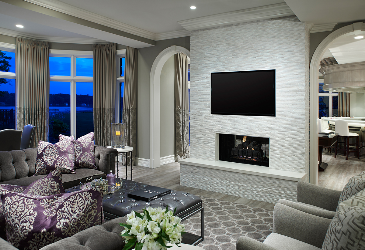
On the plus side, Nestro credits the curved shape with leaving plenty of space around it, making the bar convenient for parties. Another major transformation came from the modern stone that replaced the old cobblestone fireplace in the lower-level family room.“It has a little bit of shimmer in it; she likes bling,”Nestro says.“That was the feeling that we were trying to capture for sure.”
“Sarah and Phil are perfectionists in all they do, and there was a cobblestone fireplace and oak bar/kitchen that I knew would not work in the space no matter how I tried to force the old architectural details.”
— Cheryl Nestro, Principal and Creative Director,Tutto Interiors
 An accent wall adds a touch of modernism to the family room, says the designer of the chain-link wallpaper that is hand-printed on neutral fibers. Linen draperies have a contrast pattern fabric on the lower portion, while a plush sectional sofa provides the perfect perch. “Sarah wanted a sexy sofa. She has an awful lot of style,”Nestro says.
Pretty and practical go hand-in-hand. “Most of the fabrics I chose look very glamorous, but they’re stain-resistant, like the rug that is so stylish and you can’t kill it,” she says. The charcoal gray crushed-velvet sofa is also easy to clean, making it stand up to kids and pets.“She wanted this to be a user-friendly space for large parties,”Nestro adds.
The neutral color palette selected for the lower level blends various accents of purple, navy, gray and white. This area’s original flooring went from partial carpet and tumbled stone to a wide-plank wood laminate with a gray distressed finish. “It is the best product for areas with high traffic because it’s indestructible,” she says.
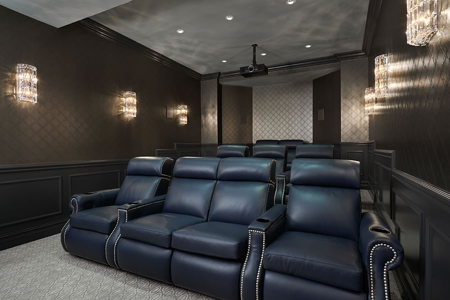
A newly refurbished theater room features refinished wainscot in dark gunmetal. “The wallpaper has an urban sophistication feel and was created by combining Italian faux leather with an embroidered stitch reminiscent of a chain link,” Nestro says. Vintage-inspired crystal link sconces light the way to custom- made navy blue theater seats that were designed with comfort in mind. The center row loveseat adds a deluxe touch.
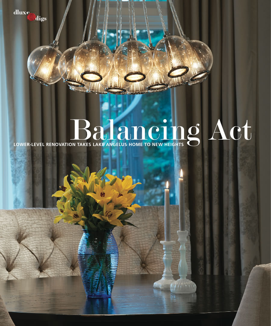
Lighting plays a substantial role in the overall look and feel of the lower level, like the significant fixture above the new billiards table that shows the impact this essential element can have on a space through its form and function.
“Light fixtures create a mood in a room and can add so much style,”Nestro says. “Sarah wanted a statement piece above the new table, and I specified a crystal fixture that expands almost the length of the pool table. It’s really an eye-catcher in the room.”
One of the biggest changes came from taking the lower level from dark to light.“Light interiors introduce happy emotions. The color palette on the bar is a feel-good look,” Nestro says. Higher-than-average ceilings contribute to the high-style space that was once dated and tired. Other striking details came from relatively minor adjustments, like refinishing the banister on the now stunning staircase, proving that even the entrance to a lower level doesn’t have to be lesser than the rest of the house.
In fact, there is nothing in this often- neglected section of the home that alludes to its location in the lower part of the home because the designer was determined to give the couple all they wanted and more.
“My clients are not typical. They wanted a glamorous feel to the space, and they did not want it to feel like you were in a lower level,” she says. “They wanted it to be as chic as possible, but material selections for flooring and furniture had to be user-friendly for entertaining.” Now, they have everything they envisioned in one exquisite destination.  — Jeanine Matlow

