Change Agent – New house in Rochester reflects homeowners changing tastes
Styleline | october 13
Sometimes you know what you want based on what came before. That was the case for a couple who asked for the opposite of what they had in their last house. “It was very rustic and Tuscan. They just were over it,” says Cheryl Nestro, who helped guide her clients in a different direction.
As the interior designer and president of Tutto Interiors in Northville explains, she was involved with the new-construction home from the get-go. The roughly 6,500-square- foot Tudor-style residence features transitional interiors.

“We used some modern and some traditional just to kind of give it a mix,” says Nestro, who got on well with her clients. “We had the right connection on top of the design aesthetic. They’re an adorable couple. They’re really fun.”Spin Doctor Nestro says the wife loves the gray palette and she loves bling. “I definitely toned it down a bit,” she says.
The husband was involved in the process. “He came to all the meetings and he was very vocal about what he liked. They have similar tastes,” says Nestro. “I love when I’m working with a husband and wife. Let’s face it; he lives in the house, too. I want to make them both happy.”
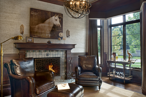
Men’s Club The library is the husband’s hangout. Grass paper walls and a wool rug lend texture to the space. The couple incorporated their love of Detroit with a Pewabic tile fireplace.
Neutral hues set the sophisticated tone. The faux paint treatment on the ceiling was done on embossed paper to resemble tin. An orb light fixture and a distressed oil painting of a horse are among the striking details.
Nestro says the leather chairs are incredibly comfortable. A wine cart with an antique brass finish comes in handy for entertaining. Tailored window treatments suit the space. “It’s the husband’s room,” she says. “He wanted it to be masculine.”
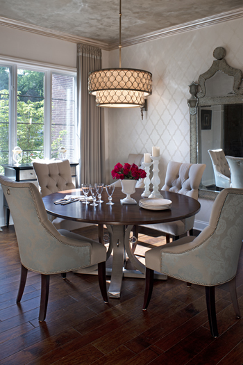
 Dinner is Served The designer and the wife were literally on the same page when both tore out the same image from a magazine that inspired the dining room chairs. “I always love to do a different fabric on the back,” says Nestro. “It’s a tight room, so we chose a round table.”
Wallpaper covers one wall while the ceiling received a faux paint treatment. A two-tiered light fixture features a silk shade accented with glass crystals.
Hand scraped walnut floors ground the space and the window treatments soften it. “There’s nothing more beautiful than draperies,” says Nestro, who embellished these with dressmaker tape along the top. “They add so much to the room, but they’re so simple.”
The unique table combines a custom base from one source with a 60-inch mahogany top from another. The rings on the base echo the ones on the chairs. Sconces illuminate the room. “The house is so beautiful during the day, but it takes on a different look at night,” says Nestro.
Shimmer and Shine The family room features a substantial light fixture that brings a little bling to the setting. Sofas and chairs complete the seating area that surrounds a cocktail table ottoman with a shelf.
An outdoor lanai gets plenty of use. The TV and fireplace make it feel like an indoor space.
A gray, geometric pattern on the off-white chairs echoes the tile on the fireplace from Virginia Tile. “I had pulled the tile for my client because it was perfect for the space. It has some real shimmer,” Nestro says. As it turns out, the wife had chosen the same one.
Simply Bedazzling They knew they wanted to do something special around the stove. “Most hoods mimic the size of the range. We wanted to have a grand design,” says Nestro about the hood that was custom made and installed by MCM Stainless Fabricating in Hazel Park that also did the stainless steel rod hanger below.
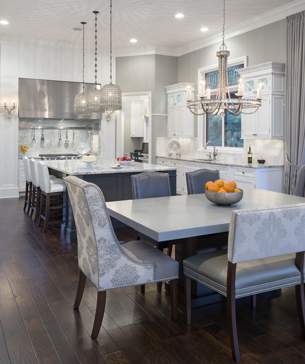
 In the kitchen, a custom hood makes a statement above the stove. Beveled glass details add a lovely touch above the sink and the door walls while vintage pendants illuminate the island.
“Because it’s a big space that’s really open, the hood needs to jump out at you,” Nestro says. “The opalescent tile backsplash adds a little bling.”
The kitchen table has an unobtrusive base that doesn’t get in the way when entertaining. Mixed seating includes a bench on one side, upholstered host and hostess chairs at either end plus side chairs. Upholstery consists of fabric and leather.
Vintage pendants glisten from above the island where the granite counter was chosen early on in the process. The base is done in gunmetal gray. White cabinets pop against dove gray walls.
Beveled, leaded glass appears above the sink and the door wall. “It adds a very lovely touch. They wanted something fun and different,” says Nestro.
The kitchen has become a favorite spot for these happy homeowners. “They’re special clients. It was just easy. They were the right fit,” says Nestro. “I love when people move into their house and they’re so excited.”
styleline | october 13
Read the PDF: Change Agent – Tutto Interior Design In StyleLine magazine Oct 2013

