
“I am honored to be a recipient of the Detroit Home Design Awards. Special thanks to all my clients who place their complete faith in what I do and together we do make the unimaginable come true! And of course all my contractors, reps and my team at Tutto! Love you all!”
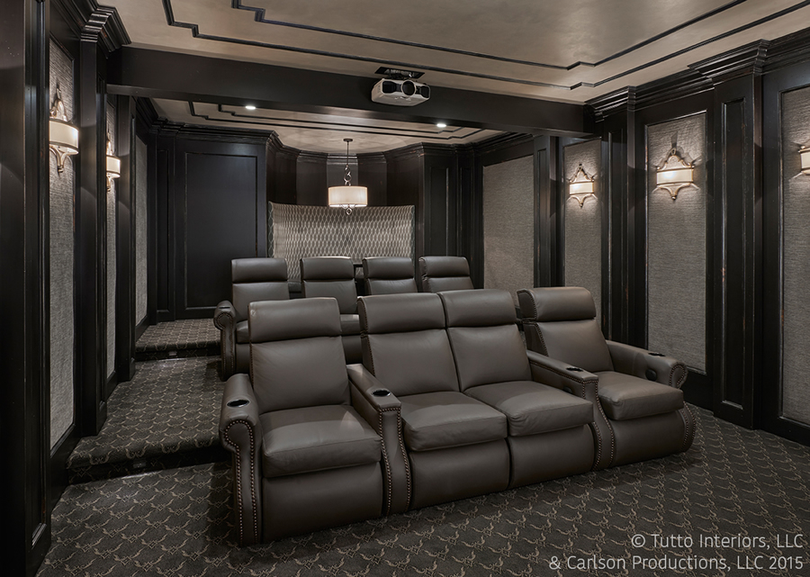
1st – TUTTO INTERIORS: INTERIORS | home theater
This home theater includes full architectural details for the trim molding as well as the finish styling. The room had a support bean that couldn’t be moved, so the paneling had to be carefully thought through for the columns to line up correctly. There’s room for eight, and a built-in banquette seats an additional four for viewing and dining. A perfect space to unwind and watch a movie!
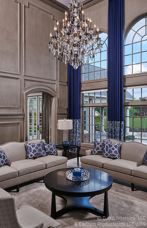
1st – TUTTO INTERIORS: INTERIORS | use of color
Several tones of gray, white, tan, and beige appear in this room, and navy adds a dramatic touch– but it doesn’t overstimulate the eye like some colors do. The result is sophisticated, dramatic, and subtle.
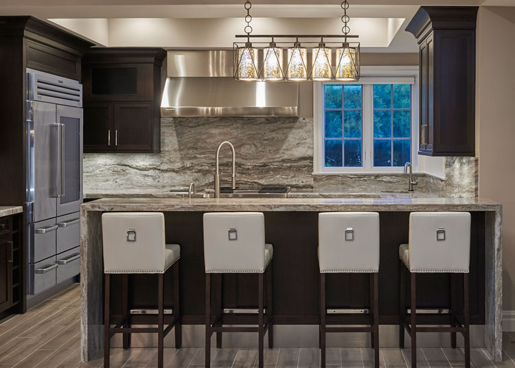
1st – TUTTO INTERIORS, with Millennium: INTERIORS | kitchen (up to 200 sq ft)
The driving force behind the floor plan in this kitchen was a 48-inch refrigerator purchased before the planning stage. Even though this is a tight space, the granite bar with the waterfall edge makes an impact, as does the eating area. The client wanted a sports bar feeling, so TVs were added along a nearby banquette wall.
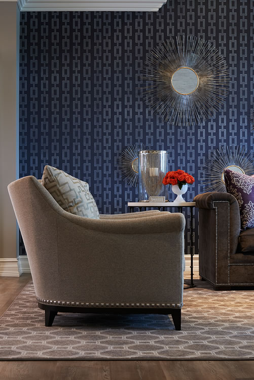
1st – TUTTO INTERIORS: INTERIORS | use of fabrics/wall. coverings
A mixed use of fabrics and wallpaper creates richness in this home’s lower level. Gray is the staple in the room, and the stark white stone on the fireplace (not shown) is a dramatic contrast to the purple pillows and navy blue chain link wallpaper. Rich fabrics and dramatic wallpaper add great texture and color to this space.
2nd – TUTTO INTERIORS: DETAILS | interior/exterior lighting
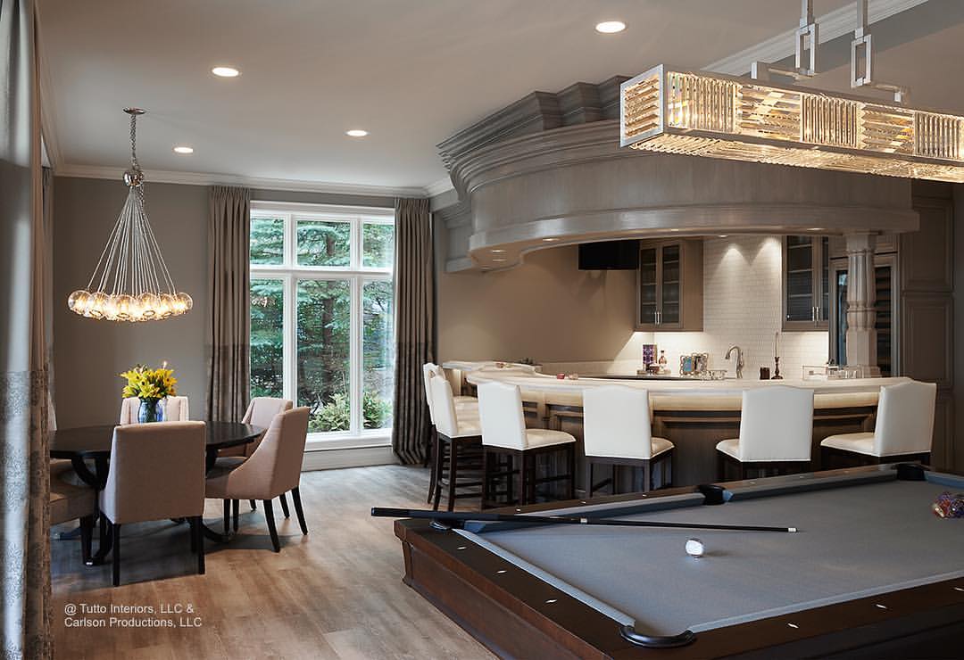
The client wanted anything but a traditional light fixture above the pool table. We replaced the old light fixture with a major touch of glam. The new, pleasantly modern pool table now has a 72″ long fixture with crystal prisms. With the billiard area being open to the bar/nook, the light fixture above the table had to have a presence of its own.
2nd – TUTTO INTERIORS: INTERIORS | traditional dining room
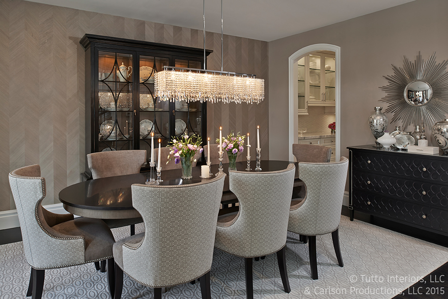
My clients had 2 requests for this room: A cabinet to hold a beautiful vintage set of china and an unorthodox crystal chandelier. The chandelier has a modern yet vintage feel to it. The dining table has a custom combination finish with a weathered stone base and dark walnut top. I felt strongly about keeping the chairs in unison with the same combination fabric on all chairs. The custom finished figure eight chest has a dark kohl finish with light gray striping. I wanted the drapery to add just enough luxury to the room yet not over power the space. The wood veneer wallpaper is the perfect accent, subtle enough but very rich and embracing! The dining room has just the right touch of sophistication for this home.
2nd – TUTTO INTERIORS: INTERIORS | traditional interior design (more than one room)
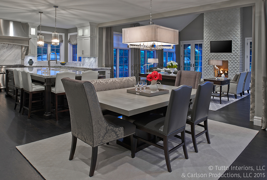
With this classic, timeless designed home, the clients wish was to keep the design traditional but not too over done. The architectural elements in the home captured exactly what the clients wished for. We merged traditional and transitional design without declaring allegiance to any one style. I like to listen to my clients, absorb their dreams, then steer that energy into something real. I look at a new construction home holistically, as each decision drives the next. I like to say as a designer we orchestrate the dreaming process. After all the decision making and sometimes agonizing over 1″ of detail, this home truly captures your senses.
3rd – TUTTO INTERIORS: INTERIORS | window treatment
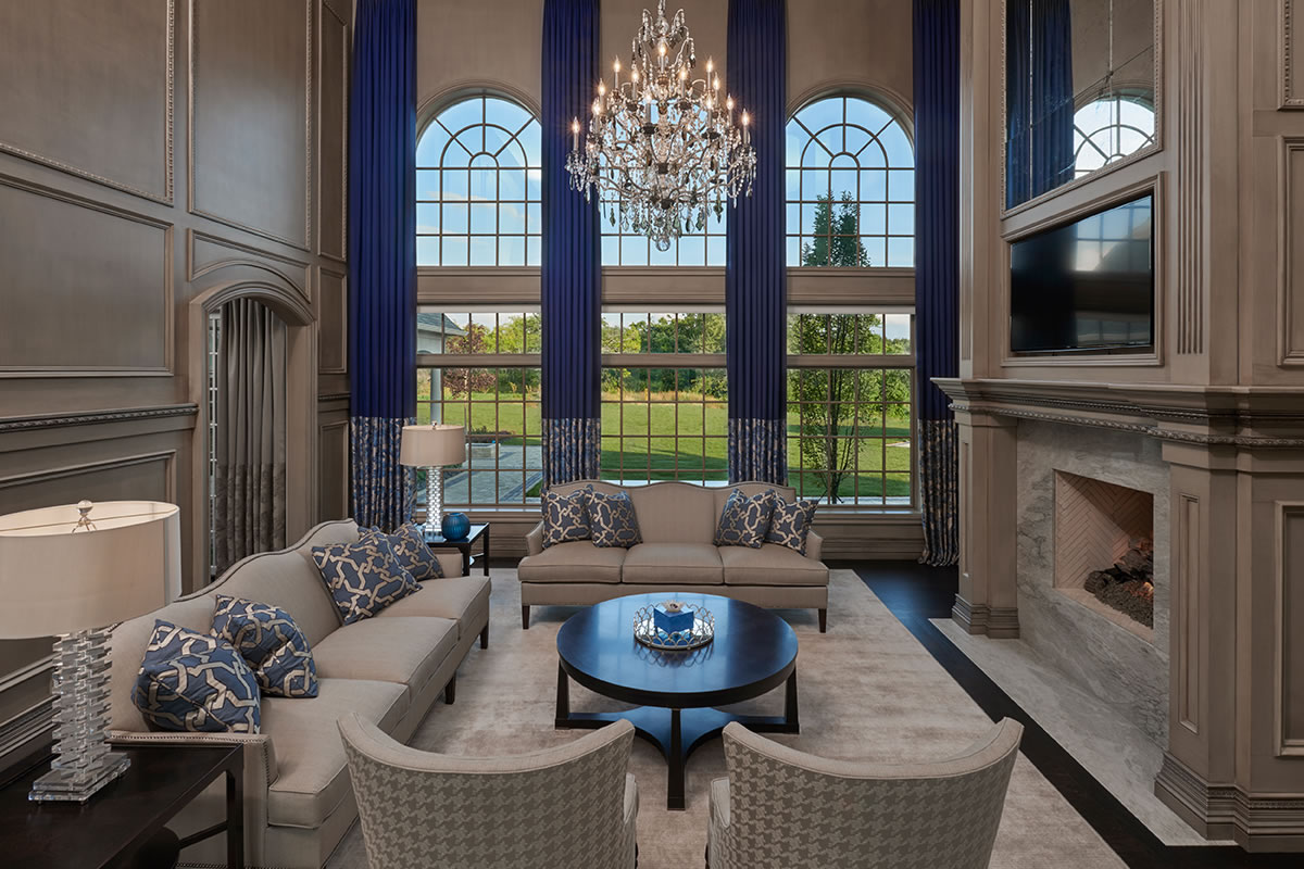
For this choice of window treatment, I rarely if ever want to cover the beauty outside. I always like to keep the window treatment steam lined and somewhat simple, but I do love the added drama to a high ceiling. To add to the dramatic beauty of the room the treatment is installed just under the crown molding.
One of my pet peeves is a window treatment that flares out at the bottom. With the length at 240″, the weight of the fabric choice has to be greatly considered. The navy blue fabric with a contrast print at the bottom is always a favorite touch. This room grabs you when entering the home yet is so subtle.

